This short article will help you narrow down what the most important aspects of your brand are so you can properly portray them to your target audience. In 7 simple steps, you’ll have everything you need to send us so we can create an amazing logo for you.

Why You Need a Great Logo
Since your logo is going to be plastered on your print media, on your website and all over the place it’s important to get it right on the first try. Even though a logo only takes up a small amount of space it says a lot about your brand and is often one of the first things new prospects will see. As they say “first impressions are everything”.

Extrapolate Your Brand’s Identy
To have a great logo that represents your brand you need to first define the core principals your brand stands for and what personality your brand uses to portray those principals. Here are some questions to ask yourself:
- Why did we start this business?
- What are the beliefs and values that are important to us as a company?
- What do we do better than anyone else?
- How are we unique?
- If we could describe our brand in three words, what would they be?
- What are the three words we would want our customers to use to describe us?
Use the above questions to brainstorm some keywords or ideas that you want your logo to represent. Tip: Brainstorming works best when you involve other people.

What Is Your Competition Using?
You don’t want to copy your competition but it is worth your time to check out the different styles of logos that your competition is using. Some industries lend themselves to certain styles so it’s OK to go with something similar, but in some cases standing out from your competition is the best choice. We’ll help you put a unique spin on any style of logo whether the goal is to be completely different or similar but unique.

Which Design Style?
Here are some different design styles. Which best represents your brand?
Classic
A classic style gives you better staying power and can help you reach a broader audience. This aesthetic keeps it simple and doesn’t venture out into crazy color palettes, graphics or fonts. A classic style tells people that you are reliable and down to earth.
Search Google Images for Classic Logos
Retro or Vintage
Vintage logos instantly remind you of the past and evoke romantic feelings of nostalgia. A vintage logo tells customers that history is important to you and that whatever you sell is done right. Worn and hand-illustrated logos in brown and beige color palettes fit this aesthetic beautifully.
Search Google Images for Vintage Logos
Search Google Images for Retro Logos
Modern and Minimalist
Brands often choose a clean and minimalist style to communicate how fresh and modern they are. This style uses a lot of whitespace, minimal details and simple lines often resulting in sleek, pared-back logos. A minimalist and modern style shows your customers that your brand is up-to-date, cool and knows what counts.
Search Google Images for Modern Logos
Search Google Images for Minimalist Logos
Fun and Quirky
This is a popular choice for brands with a young (or young at heart) target customer. Fun and quirky style tends to be colorful and cute and often uses symbols or illustrations to create a positive and friendly vibe. Go for a whimsical mascot or a sweet illustration to let your brand’s fun character shine through.
Search Google Images for Fun Logos
Search Google Images for Quirky Logos
Handmade and Handcrafted
Handcrafted style transports a clear message: this brand is individualistic and stands for handmade quality. The style works well in combination with other aesthetics, like vintage, to really drive the message home. But it can be combined with minimal and fun styles as well for a simple and sophisticated or a bright and youthful look.
Search Google Images for Handmade Logos
Search Google Images for Handcrafted Logos
Combining Styles
In most cases, we can combine two different styles from above to make a hybrid version of the styles. For example, your brand may benefit from a handmade style that is a little quirky as well.

Which Type of Logo?
Now that you have a better idea of which style of logo you need for your brand it’s time to pick a type of logo. Here are 7 different types of logos.
Lettermarks (or monogram logos)
Lettermark logos can be great to streamline your company logo, especially if your name is very long or hard to remember. Lots of businesses choose to go by their initials, just think of HP, CNN or H&M. These monograms can be great for minimalist logos, but remember that they are not very good at expressing what your business is about.
Wordmarks (or logotypes)
Wordmarks are a very straightforward way of using you company name as a logo. To give them personality and recognition value, they are all about typography—just look at the wordmark logo for ONE. If you’ve got a great name for your brand, this could be the perfect way to put it in the foreground.
Pictorial marks (or logo symbols)
Pictorial marks or logo symbols are what we think of when we hear the word “logo”. They are iconographic images that are easily recognizable and represent your brand with an image. You can choose something simplistic or more complex, but make sure to pick a symbol that creates a unique connection to your brand. Oftentimes these are paired with a wordmark (ya know, so customers know your name… at least until you’re on par with Apple and Target in terms of brand recognition).
Abstract logo marks
Instead of a recognizable symbol, abstract logo marks are geometric forms that don’t establish an immediate connection to an existing image but create something entirely new for your brand. An abstract logo mark will condense your business into a symbol that is truly unique to you. The logo for Printy shows how modern an abstract symbol can look, while having lots of personality at the same time. If you want your abstract logo to create a certain mood or feeling, find out the meanings of different geometric logo shapes.
Mascots
Mascot logos are a fun way of giving your brand a personality. They are often colorful, cartoonish characters that represent your business in a family-friendly and approachable way, like this cheerful Gadget Mole.
Combination mark
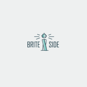
A combination mark does exactly what it says on the tin: it combines a symbol with a word mark to create an easily recognizable logo. The brand name is either placed next to the symbol, or is integrated in the graphic element, like designer ludibes demonstrates with the Brite Side logo. People will associate both elements with your brand, which allows you to use them both alone or together.
Emblem
Similar to combination marks, emblem logos are also often a combination of word and pictorial elements. They usually consist of text integrated in a symbol or icon, such as badges, seals or crests. The Rockwell Lighthouse emblem shows, how these traditional shapes can give you a very old-school and classic appearance.

Choose the Right Color
Colors can have a ton of different meanings. The psychology behind color is complex, but to keep it short, colors have certain emotions and ideas attached to them. To learn more about color theory be sure to check out this in-depth guide on logo colors and their meanings.
- Red: Red stands for excitement, passion and anger. It’s a great choice if your brand is loud, youthful and wants to stand out.
- Orange: Orange is much less used than red but it’s just as energetic. This is a vibrant, invigorating and playful color.
- Yellow: If you want to look accessible and friendly, yellow is the right choice. It gives off a cheerful, affordable and youthful energy.
- Green: Green is extremely versatile and can work for any brand really. It’s especially perfect for anyone who wants to establish a connection to nature.
- Blue: Blue is a very classic and common choice. It is calming and cool and symbolizes trustworthiness and maturity.
- Purple: Purple can be your ticket to looking luxurious. Depending on the shade, purple can be mysterious, eclectic or feminine.
- Pink: If you’re going for girly, nothing works better than pink. But that’s not all! With shades like pastel rose, millennial pink or neon magenta, pink can give your logo a grown up and cool, but still youthful and feminine look.
- Brown: Brown may sound like a strange color choice at first, but it works perfectly for rugged and masculine vintage logos. It can give your brand a handmade, unique and aged look.
- Black: If you are looking for a sleek, modern and luxurious look, black will be a great choice. A minimalist black and white logo is the way to go if you want to keep it simple.
- White: You want your logo to look clean, modern and minimalistic? Use lots of white in your logo. As a neutral color it works in combination with all other colors, but adds a clean, youthful and economical touch.
- Gray: Gray is the ultimate color if you want to achieve a mature, classic and serious look. Darker shades look more mysterious, while lighter shades are more accessible.
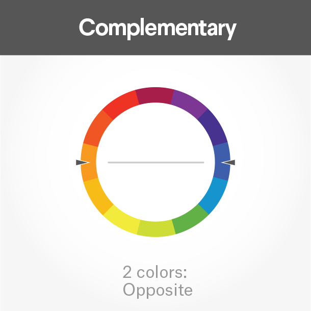
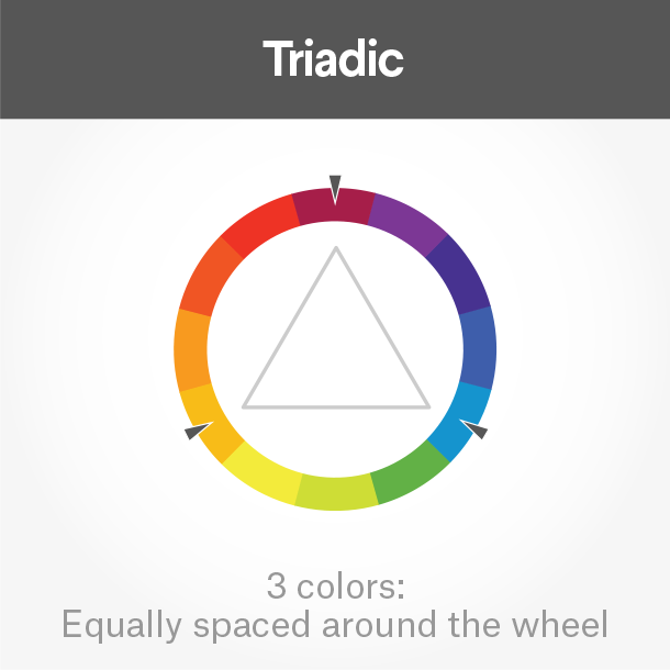
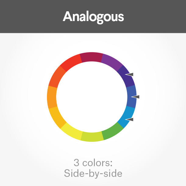
Combine Colors
Of course, you don’t need to stick with a monochrome logo using just one color, but you can combine several logos colors to tell a complete brand color story. To choose colors that work well together, take a look at the color wheel.
- Complementary colors lie directly across from each other on the color wheel. They bring out the best in both colors and create a very dynamic look.
- Analogous colors fall close to each other on the wheel. If you want your logo colors to be harmonious, these will work well together.
- Triadic colors draw from three equal sections on the color wheel. Pick these for a stimulating and bold effect.

Choose a Typography
You want to pick a font that complements and completes your logo. There are 4 basic types of fonts you can work with to give your logo a unique look.
Serif Fonts
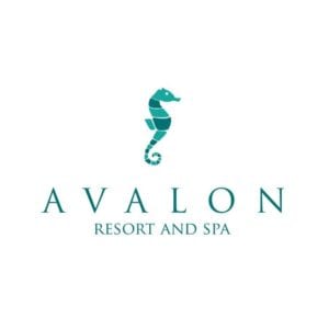
See how the font gives the Avalon logo a chic and timeless look? Serif fonts can make your logo look classic and high-end. Serifs are the little “feet” at the end of the letter, which makes them look a little more old-fashioned. They are very versatile and look great with any kind of design, but work especially well with vintage, elegant or classic designs.
Sans Serif Fonts
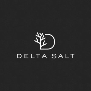
Sans-serif fonts are perfect for a modern and clean look. They don’t have the little feet that serif fonts have which makes them look very sleek and simple. This works great for modern brands, like the minimal and cool Delta Salt logo.
Script Fonts
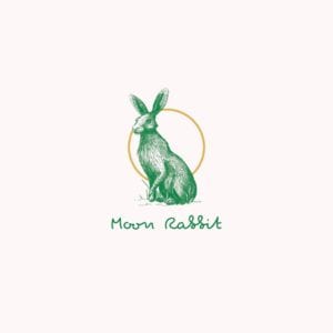
Script fonts are reminiscent of handwriting. From elegant calligraphic fonts to relaxed and down-to-earth scripts, there is a huge variety out there. Use them to make your logo look more individualistic, like this Moon Rabbit logo.
Display Fonts
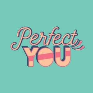
Display fonts are decorative fonts that are highly stylized and really catch the eye. Take a look at the Perfect You logo above that uses a display font to give the design a fun 70s flair.
Bring Your Design Elements Together
Now that you have an idea of all the different elements your logo will consist of, we need to make sure that they work together. You want to pair them in a way that is harmonious to create the look and feel you want your brand to portray. Search through Envato Elements and Megapixl to find some logo elements that match your vision the closest. Remember to use the keywords you’ve established from your journey through the above article to help you narrow down to some images that are close to what you’d like us to create. Copy the URL of each logo that stands out to you and paste them in the form below so we have a starting point for your new logo. Remember we’re just using them as a starting point so you don’t need to find images/logos that match your vision exactly, just in general.